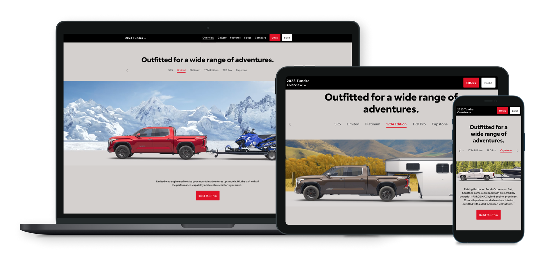
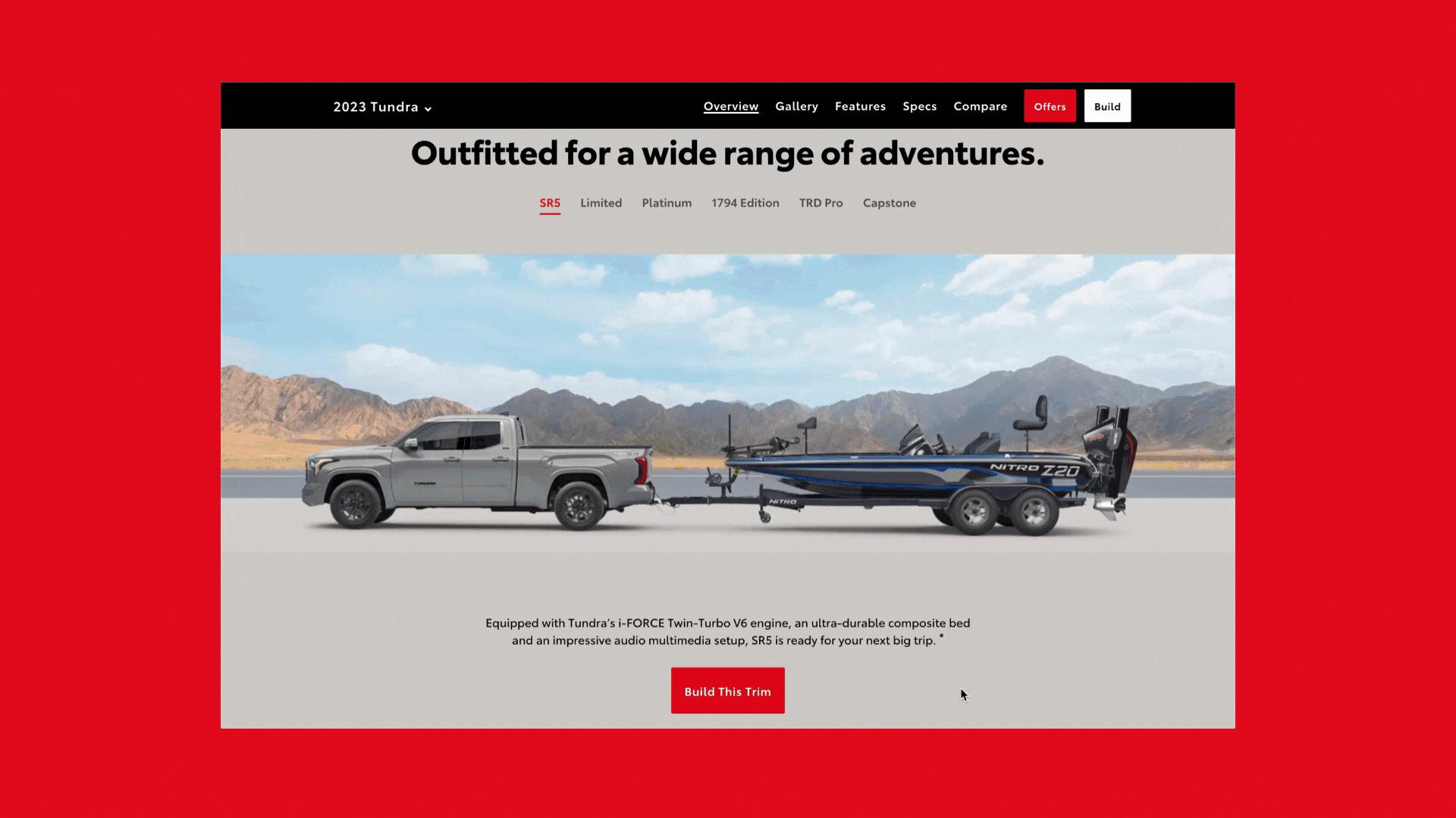
Tundra Super Bowl Campaign
Tundra has made a comeback with a new enhanced truck release. With the Super Bowl approaching, Toyota decided to highlight the latest release in this year’s campaign. I was tasked with story telling and visual designs efforts for this campaign. I worked on enhancing existing components across breakpoints within the Model Landing pages to really spotlight this launch. The new grade walk below would highlight Tundra’s towing capabilities and theme around “Go To Places”. Various meetings were held amongst engineers and content creatives to discuss feasibility on the below final story telling piece, showcased during the Super Bowl 22'.
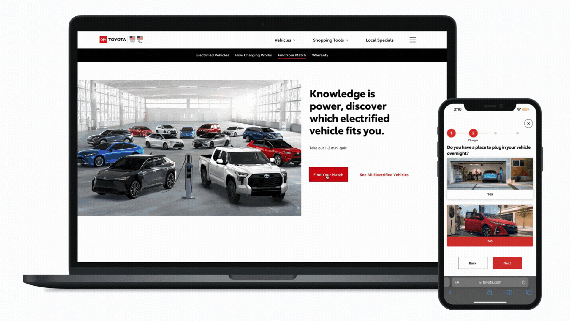
Electrified Vehicles
Toyota has a line of electrified vehicles that some consumers may not know about. I was tasked with creating an informational interactive quiz that would bridge this gap on the Electrified page. The quiz creates a personal experience tailored to the driver, generating electrified vehicle results depending on the driver's interest and lifestyle.
Wireframing, concepting, and execution on various breakpoints were developed. All information architecture, edge cases, capabilities to edit past answers, multi select, and user flows were considered in the product shipped below.
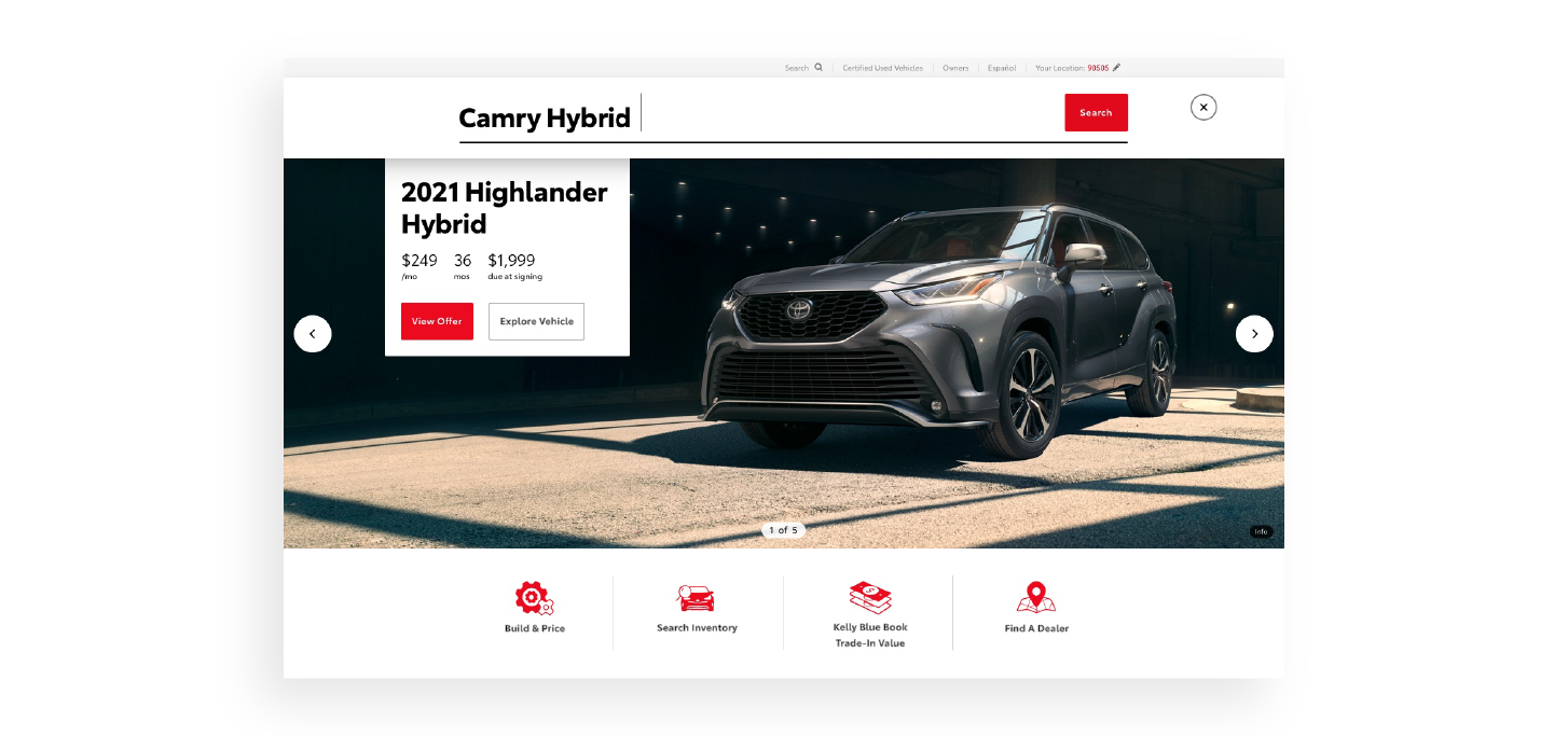
Design System
Global styling takes place across the site, with ample design rules in place. I worked to maintain and update components within Invision's Design System Manager so creating new pages in Sketch was quite seamless. Below is just an example of some design components with rules across devices.
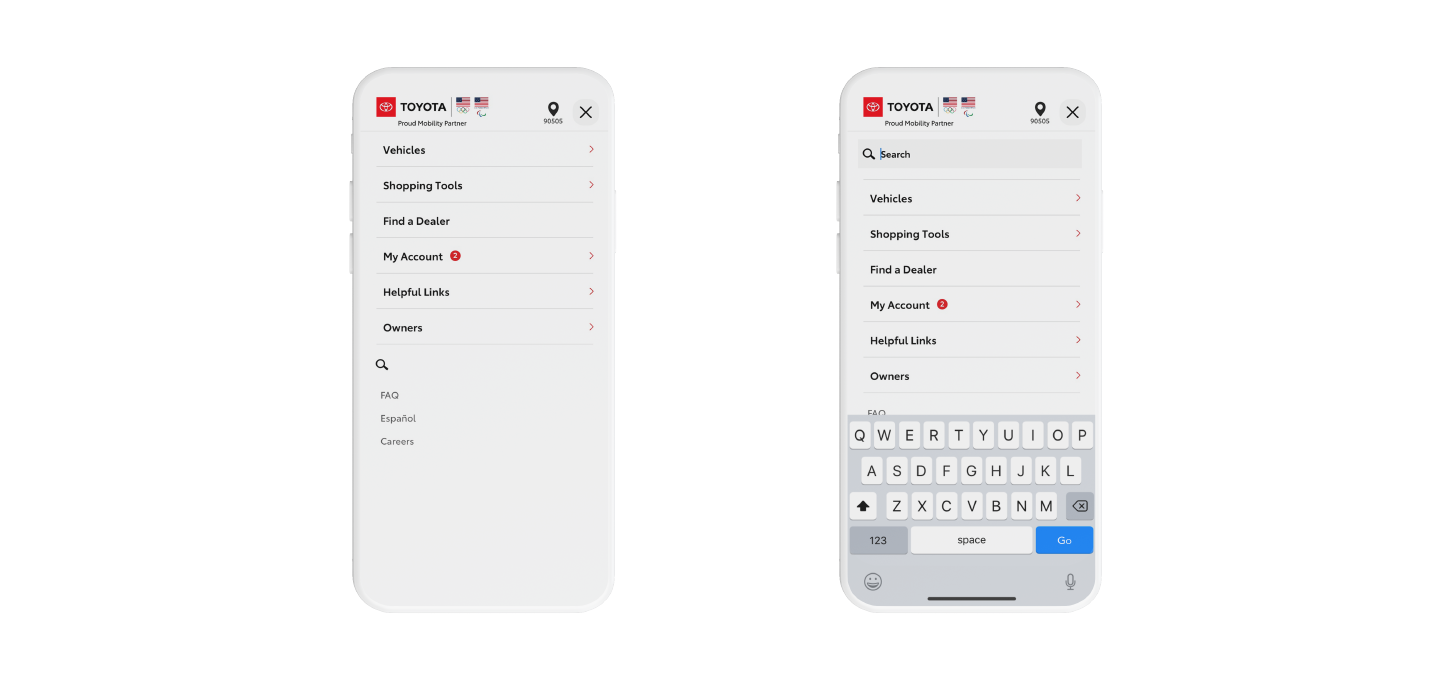
Global Navigation
The global navigation was created with a mobile first approach in mind. Prior, the Toyota site wasn't supporting mobile search at all. After some careful review of the mobile functionality, it was best to keep the Search component within the menu navigation as there would be too many icons along the Navigation bar. There is also an inactive and active interaction that was netted out with the Development team. Search across Desktop and mobile breakpoints have been updated with current Toyota styling.
Icon Library
In addition to the design system, there is an icon library that required maintenance. I was tasked with creating new icons while documenting style rules within our Design System Manager. Below are a few icons I created after briefing the Toyota client, these felt most appropriate for the specific asks. The icons all have a 4px border, no fill, connected sharp corners, and Toyota red implemented for a recognizable cohesive feel.


Motion Design
With the Toyota Digital Redesign effort in play, I was able to flex some motion design skills. Below are a few elements pitched for the newest model display page launch. The interactive experience is a lot more immersive compared to the standard static automotive pages seen across competitors.